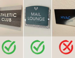
Take a look at our Top 10 successful apartment transitions and see how old & tired became hip & relevant!
You’re at a great advantage when you reposition a property. You can see what is working with your competitors, evaluate what is missing at your community, invest in new technology, improve weathered facades, update amenities, refresh units and completely re-energize the property with a fresh and relevant image…. Sometimes with only a small amount of capital you can make major improvements.
Your identity, whether it’s a free-standing monument or a building sign, can announce to the world that… things have changed for the better. As mentioned, you are actually in the best position to reinvent the approach with the latest lighting techniques, overcome mature landscaping, take advantage of key traffic areas and reimagine your community with a bold up-to-date image.
Our firm designs and implements branding for new construction and reposition properties. It’s always our job to establish a community’s identity and brand that speaks to a target audience, directs, informs and communicates a consistent story. Robinson Creative has been involved with some powerful and dramatic facelifts in our 20+ years in property management branding.
When investing in an older community, many choose to rename if the property has a poor image in the marketplace. However, sometimes it has a great name but needs to be infused with new colors and a renewed logo.
Here are some of our greatest transformations, the ‘before’ handicaps and key changes that reinvented the community to a new audience.
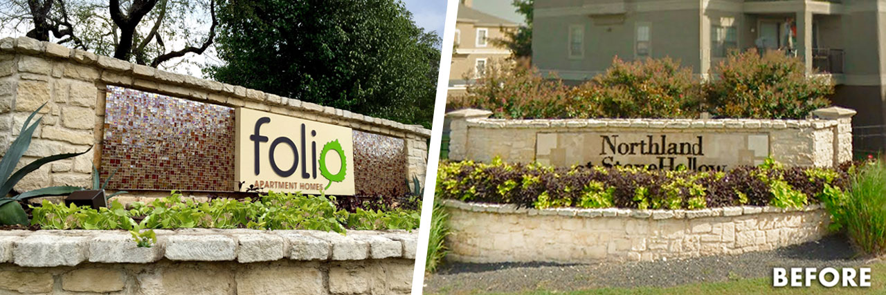
Folio:
Handicaps: Dated name, massive community, three wall monuments and heavy City restrictions.
Solutions: RC established a new, shorter name. Less letters gives you larger more prominent letters! Reinvented restrictive walls with glass metallic tiles and illuminated brand for a more relatable & organic approach..
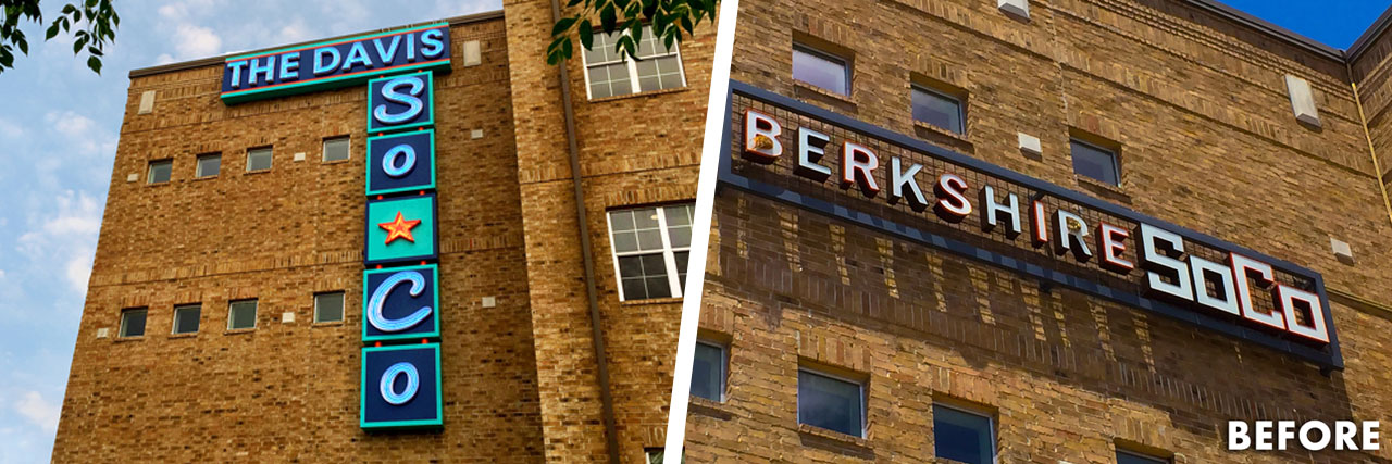
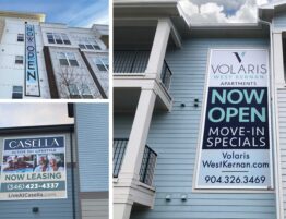
The Davis SoCo:
Handicaps: Changing local area, confusing wayfinding, hidden office and not utilizing advantageous traffic windows.
Solutions: RC connected with the vibrant area with retro neon, large iconic and visible identity, capitalized on key areas and simplified the prospect’s path to leasing.
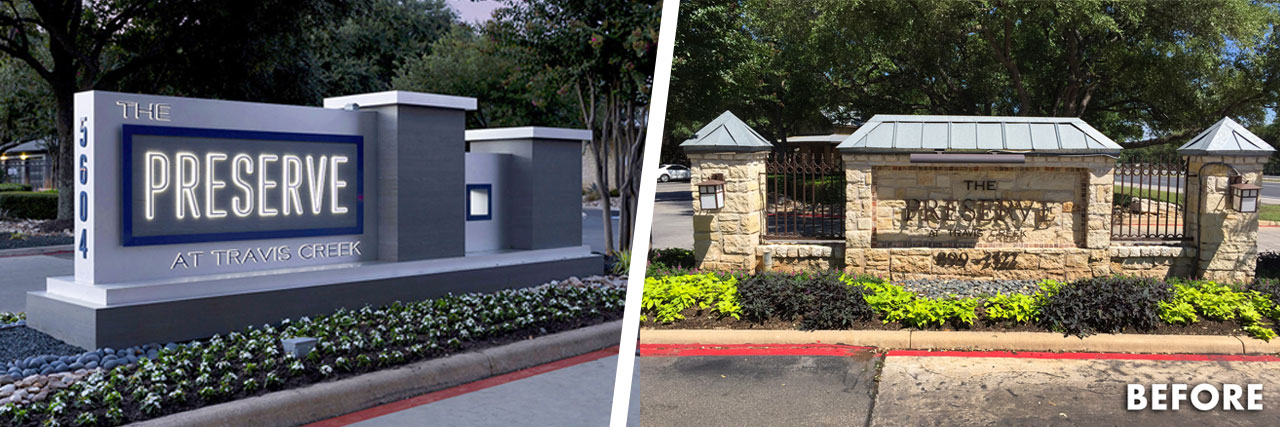
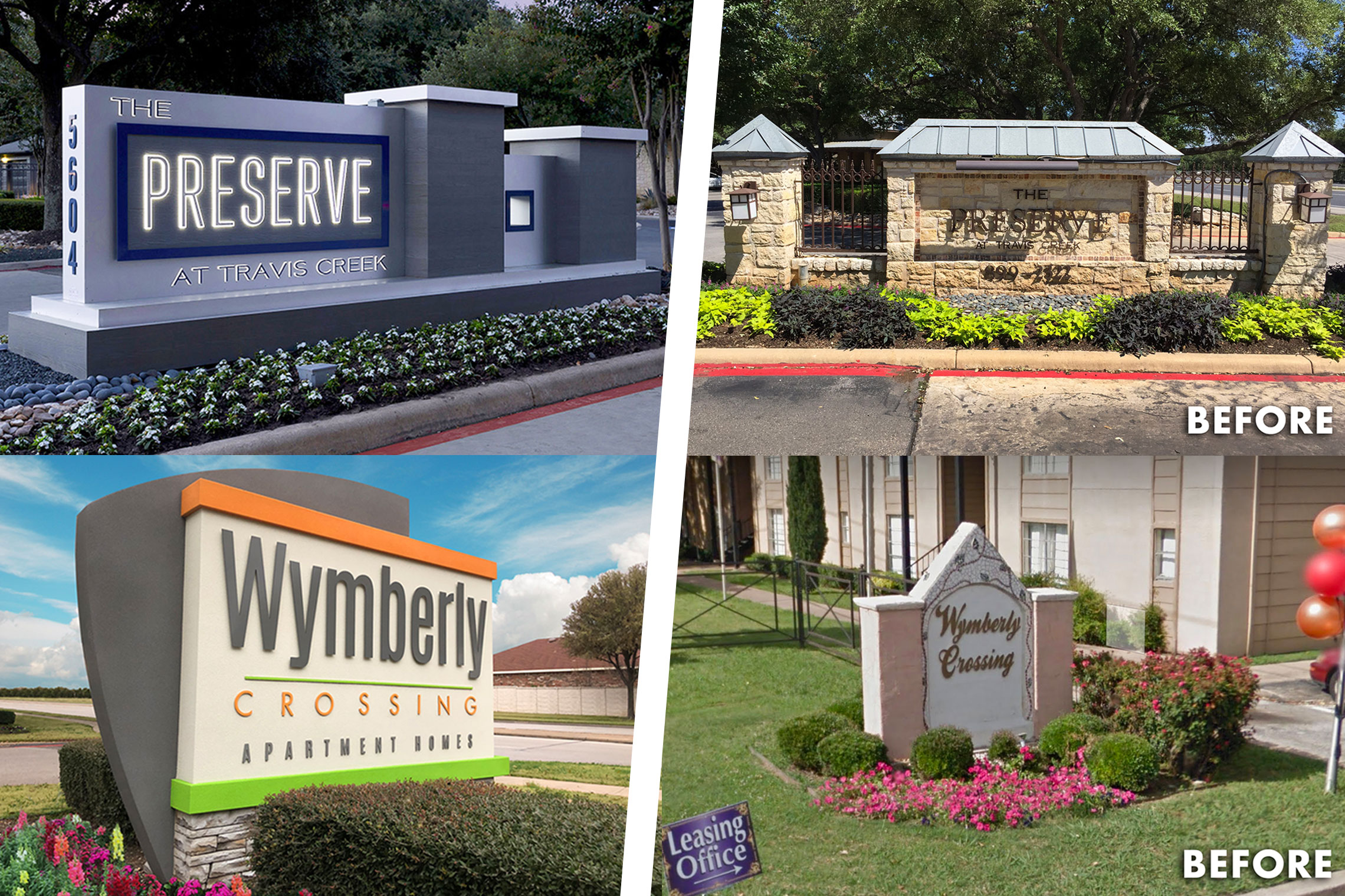
The Preserve:
Handicaps: Dated monument, no illumination, limited budget and large community competing with new construction.
Solutions: RC refreshed the monument by connecting it with the new interior renovation and materials, designed innovative monuments with creative finishes and dynamic details for a captivating 24/7 identity!
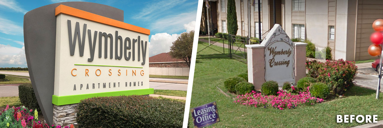
Wymberly:
Handicaps: Dilapidated monuments, neglected community and multiple City restrictions limiting improvements.
Solutions: RC utilized urethane monuments to save money but reinvented the community’s appeal. High-pressure laminate signs were also employed throughout the community for an exciting and connected brand.
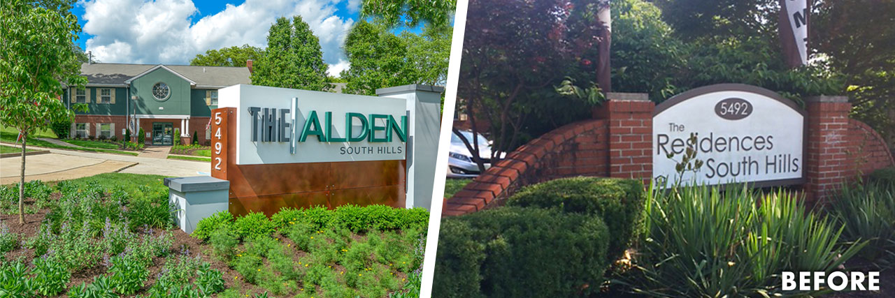
The Alden:
Handicaps: 50+ year-old community with poor reputation and limited budget for large community.
Solutions: RC used less expensive but inventive techniques to update the property with an industrial-themed monument that connected with the community’s heritage. Cost-effective Design Studio was utilized on all community signage.
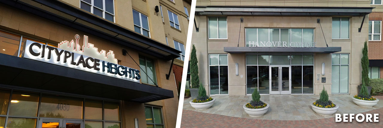
CityPlace Heights:
Handicaps: New owner with new name that must use existing sign locations in very difficult to access areas with poor wayfinding.
Solutions: RC established stunning visuals by using impressive lighting techniques and added a vertical monument directional in a limited space, to assist the prospect’s journey.
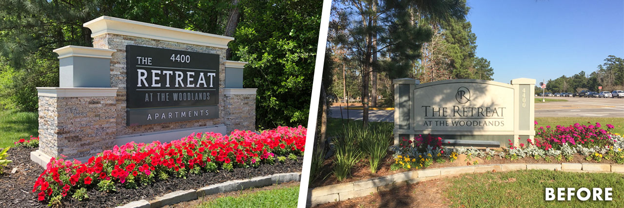
The Retreat Woodlands:
Handicaps: Small and poorly designed monument within a restrictive City.
Solutions: The newly designed monument capitalized on its location and optimized the traffic window with a more impressive and upscale look. RC was able to work with the City for the best outcome and established a dynamic and elegant signature identity more connected to the community.
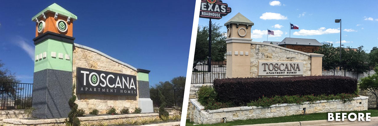
Toscana:
Handicaps: Massive but vanilla monument with freeway exposure and hidden community behind retail.
Solutions: RC re-worked the large monument with bold colorations, glass tiles, flood lighting, suggested more open landscape concept and added an internally illuminated face. RC is currently working community and wayfinding signage. Look for future updates!
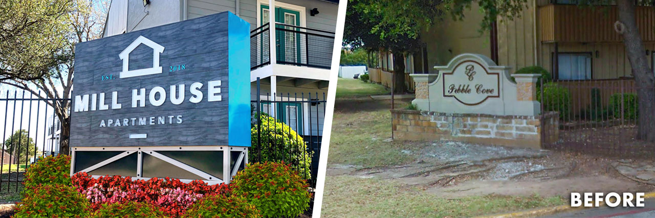
Mill House:
Handicaps: Dynamically renovated community needed an equally exceptional signature monument on a tight budget.
Solutions: Taking its cue from the newly refreshed facades, RC incorporated similar materials, shapes and style to establish a new branded identity that reflects the community’s bold approach to living.
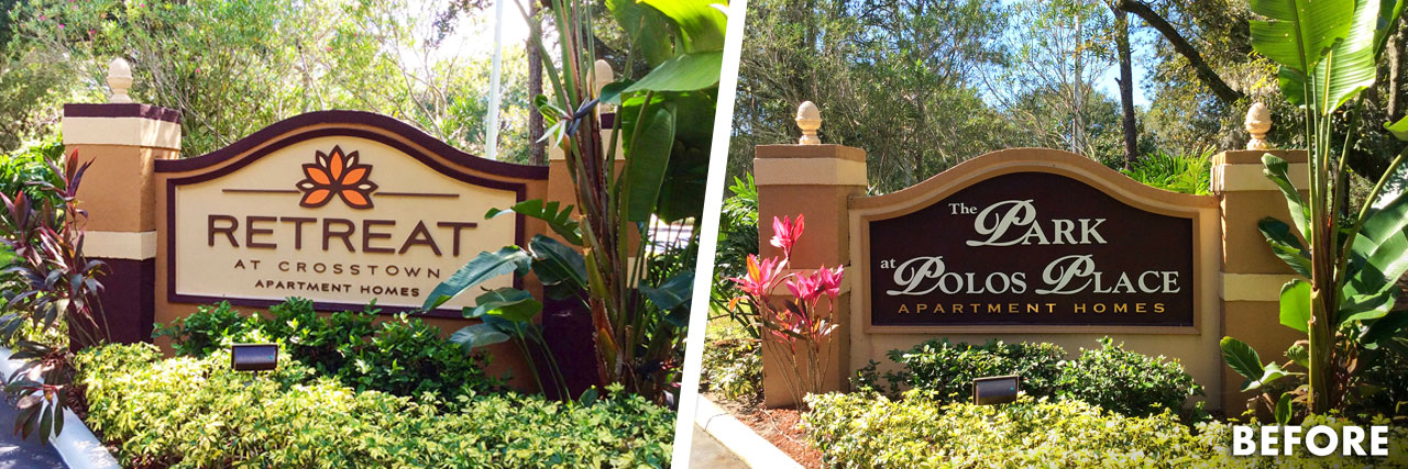
The Retreat at Crosstown:
Handicaps: Weathered property with poor reputation and tired monuments on a limited budget.
Solutions: With little funds, RC reinvigorates the large monuments with new branded paint colors and updated, applique logo and name. The power of paint and simple graphics is an unforgettable combination that propelled this community and saved the budget!
“Change the way you look at things and the things you look at change.” ― Michael Michalko
Whether it’s simply new colors or an entire reimagined sign, your older community more than likely needs a fresh perspective, relatable to a new audience. If you’re spending the money to reposition your property, don’t forget the first thing they see… The signature identity!

